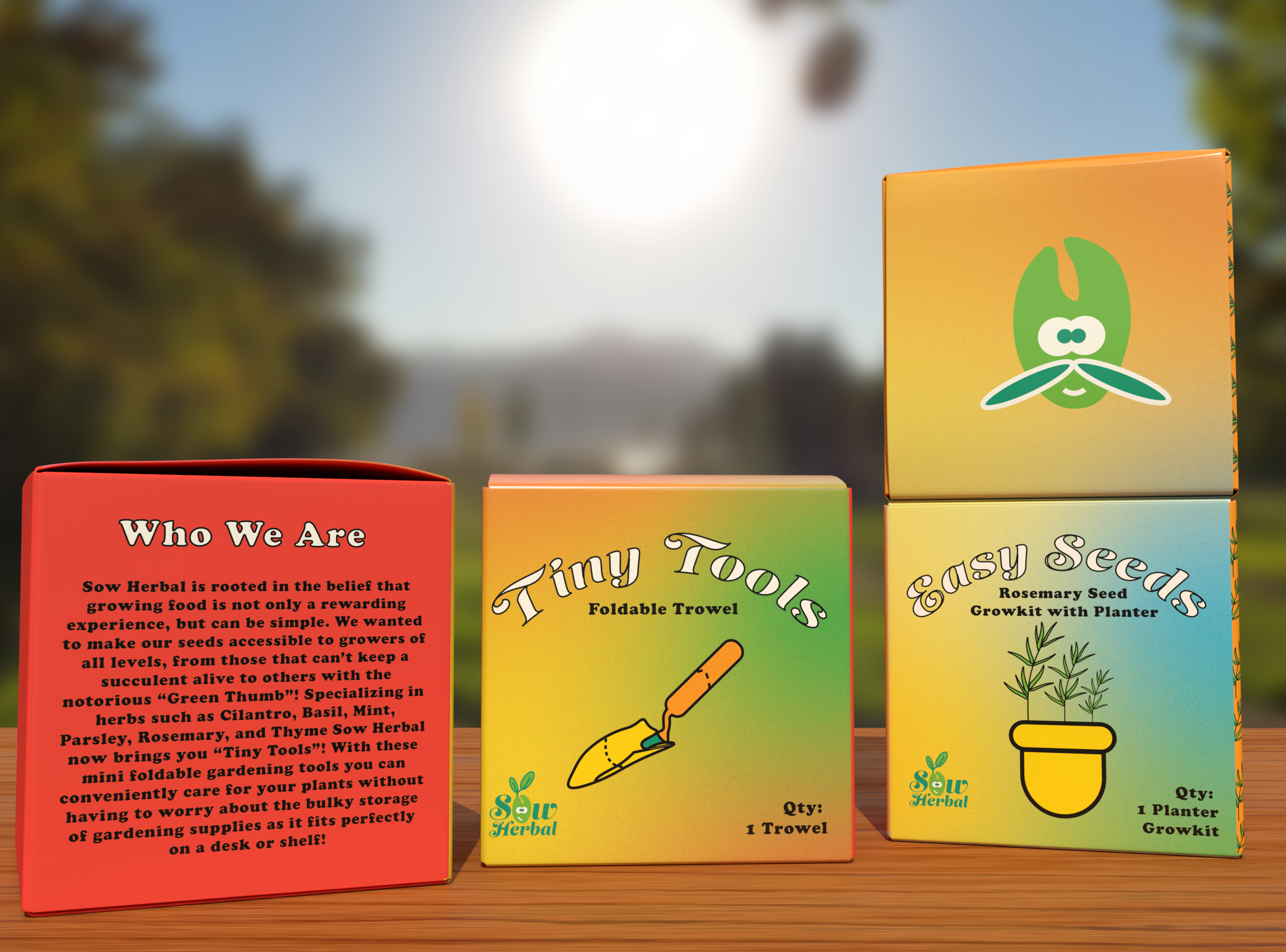
sow herbal package design
-
Sow Herbal is a conceptual gardening brand designed to cater to growers of all backgrounds and experience levels. The brand specializes in miniature grow kits, each containing mini planters with starter seeds for a variety of herbs. Additionally, the brand offers a product line called Tiny Tools, which provides foldable, compact gardening tools for convenience and portability. The project involved creating a cohesive visual identity that reflects Sow Herbal’s mission: making gardening accessible and enjoyable for everyone, from novice growers to experienced gardeners.
The goal was to craft a unique and approachable aesthetic that reflected the brand’s organic nature, while ensuring visual consistency across all mediums. The design aimed to evoke a sense of simplicity and sustainability, inviting gardeners to engage with nature in a way that is both practical and inspiring.
concept
Sow Herbal is more than a brand; it’s a celebration of growth, both for the plants and the gardeners who nurture them. This project explores the intersection of nature, minimalism, and design, weaving together functionality with artistic expression. The brand's identity revolves around the theme of growth in miniature, a metaphor for how even the smallest seed or tool can foster life and creativity.
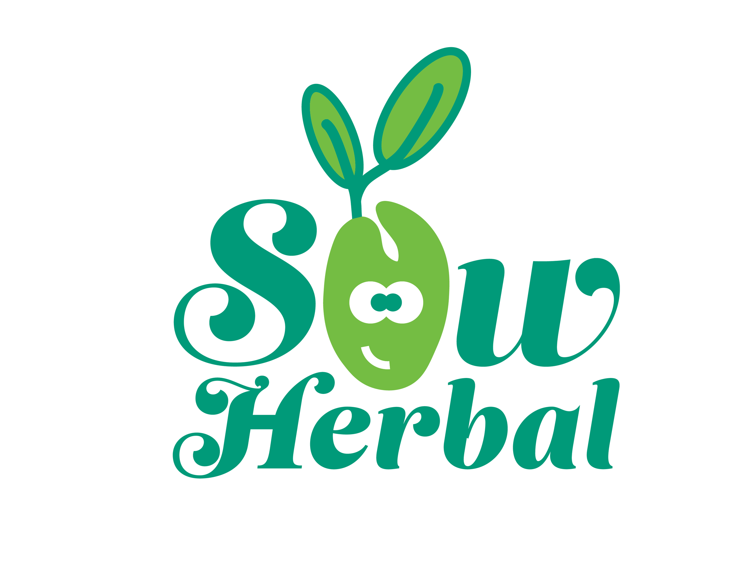
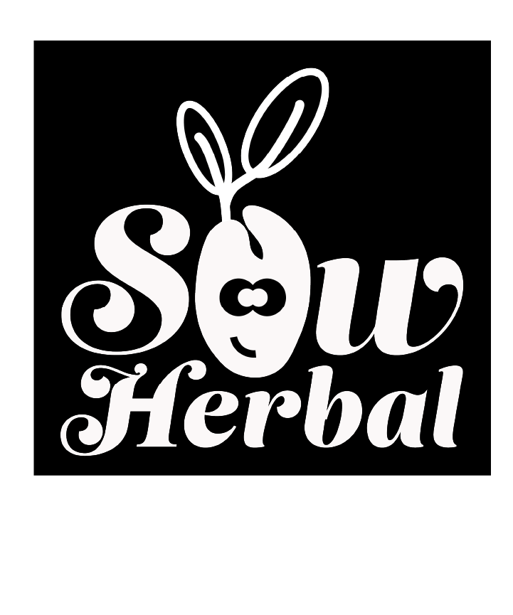
brand logos
I began by designing the Sow Herbal logo, which features modern, organic shapes that symbolize growth and nurturing. Seed-like elements were integrated into the typography, emphasizing the brand’s connection to plant life. The logo is versatile, working seamlessly across digital and print applications.